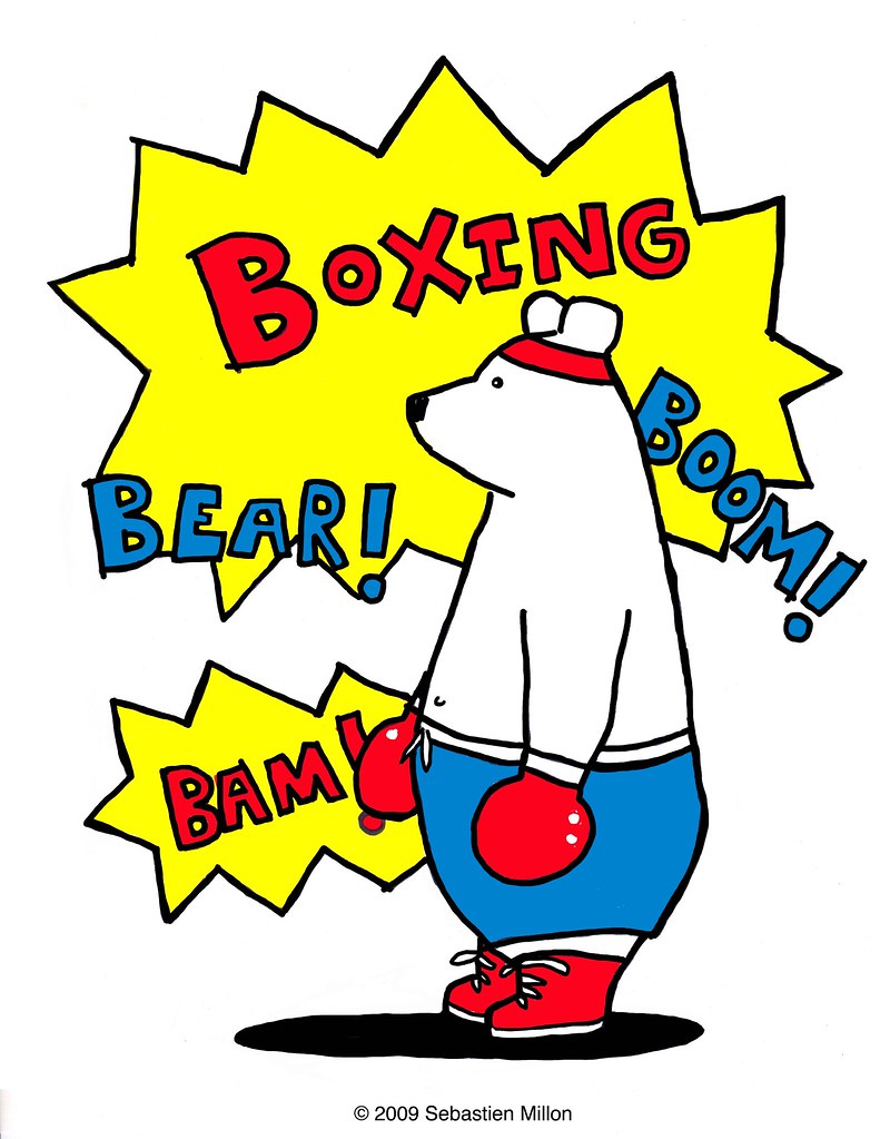
Hi guys, hoping to get a little advice from you. If I were to make this image into a shirt, do you have any things you'd like to see changed, added, removed, colors changed, words changed, lines done in a different way, the bear in a different position, etc, etc... Right now I'm thinking of having this image printed on a white t-shirt. I'm happy to hear any sort of idea, or ideas for other shirts as well. And even if you say you love this image, don't worry, I won't consider it a binding agreement that you will have to buy the shirt :)
Whatever you say, don't worry, I take criticism very well (uh, that's what I say, but please don't ask the victims of my insane anger about my ability to take criticism).
 You totally need to subscribe to my site. Seriously.


11 comments:
Oh Boxing Bear... I love you just the way you are!
Bee-ay-you-tee-full.
Seems Boxing Bear is your totem. I like that he’s “confident but not effective.” Isn’t he a bit like you and me? The only thing I would change in the drawing is to move the word “bear” up and away from the jagged balloon lines a bit, give it a little more isolation.
I like your other characters too, though. I think for a T-shirt I’d go for something a tad more enigmatic like the Recreational Floating Club, or the Acme Star Machine. But that’s me. You’re very talented.
Ananda Girl: Awww, you are too sweet. Always too kind!
Laura: haha, thanks!!!
Jeaux: Awesome, thanks so much. And thank you for that idea, I will play around with the word Bear.
For some reason I've been drawing lots of boxing bears lately, I have no clue why, hehe.
That is a great name for the Recreational Floating Club! I am working on a Floating Shirt. I was thinking of using the words "Let's Levitate" on the shirt, to keep in line with the L's because there would be a lion floating with the kids. But Recreational Floating Club has such a great ring to it!!! I am torn.
Well, for me it's a little too red/white/blue. I keep thinking it;s supposed to be patriotic in some way.
Oh! Hearing about levitating reminded me to tell you what my home screen image is....L is for Levitate!
You are simply wonderful Sebestien! I think that the shirts are a fantastic idea, especially the floating kids. I am truly taken with them.
I think this shirt like the Lightening Bear would look really good on black because it would make the yellow pop. Although that would make your polar bear into a black bear which I don't think I would like as much. How about on black but keeping the bear white?
It is also interesting that you are using more colors in your backgrounds these days. Any reason for that?
Pamela: Yes, I can see that. Hmmm, I've been using these comic booky colors alot, I'll see if I can play with the colors.
Laura: That is wonderful, b/c I have surprise for you in the mail that will please you :)
Gary: Thanks so much! I absolutely agree about the black, will def. keep the bear white. Hmmm, not sure what is going on with my playing around with background colors. I do prefer plain white, but just to mix things up I suppose, hehe...
I like the comic book colors, and I just noticed you tend to use red, white blue and yellow. I guess here it just kinda stands out more.
But I agree with your observation, it does have that red white blue thing going. Will see if I can find a way to change it up so it makes more sense with the image :)
I agree with Gary too. I saw the shirt Tara bought, and it would have had much more impact on black.
Post a Comment